Jay Cooke Trail Map
Map & Brochure Design
—
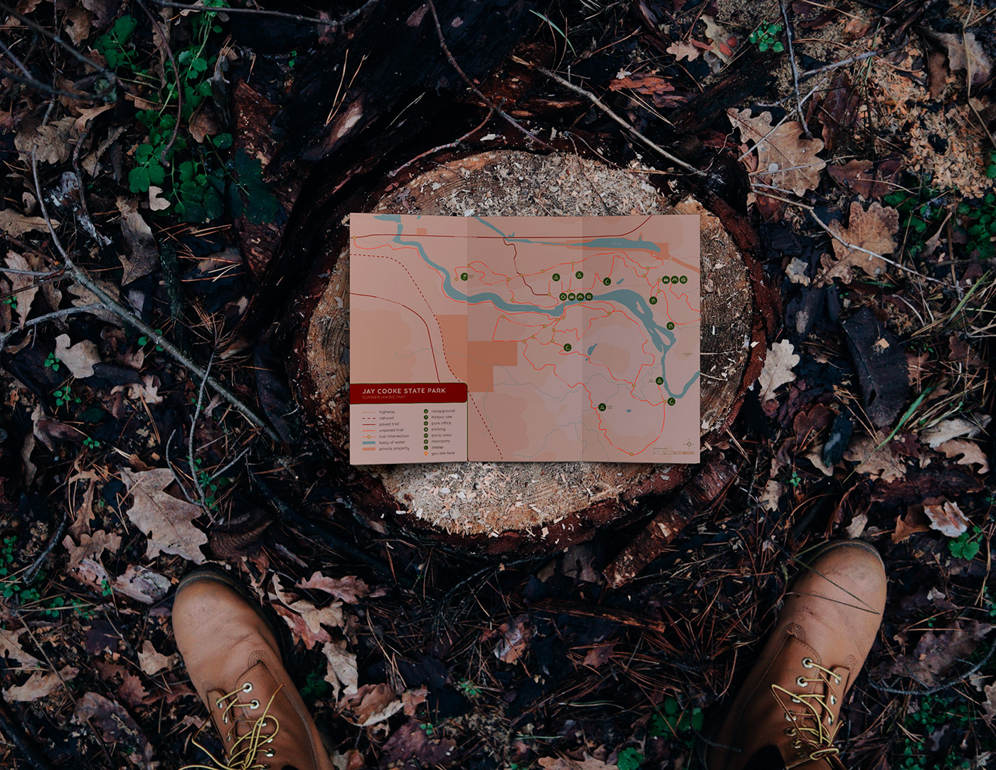
I wanted to do another project I’m passionate about while focusing on depth and experimentation with my design. If you've seen some of my other work before, you may already know that I am extremely passionate about the environment, getting outside, being active, and going on adventures. Since it was the middle of winter with freezing temperatures in Minnesota, and I hadn't had a chance to get outside I wanted to live vicariously through my project and get excited to be outside. My idea was to redesign the trail map for my favorite park, Jay Cooke State Park. This project really challenged me to figure out how to organize a ton of very important information in to a small area. Prior to this project, I had no idea how labor-intensive cartography truly is. I knew it was complicated, but actually trying my hand at it was a different story. The success of this map lies in the layering and hierarchy of information.
Color was an important factor. My concept was to use earthy, natural, and/or neutral tones as a base to reflect a connection with the earth and being outside. I wanted to be able to show topography using a slight shift between these neutral colors. These colors were primarily used for elevation/terrain changes, water, and natural features. This allows those features to be pushed back into space due to the figure/ground relationship and color hierarchy. The trails and icons are the most important part of the design since it is a map that would help the user navigate through trails in the park. Bright colors were chosen for the trails and icons to stand out from the neutral background, but they still remain harmonious with the overall natural-feeling color palette. Attention to detail was a large part of this project. The accuracy of the topography, trails, icons, mile markers, etc were a priority along with the overall aesthetic of the map. I wanted to make the map look more "designerly," systematic, and intentionally designed. Every detail had a significant amount of attention, including the typography, terminals of the rules, the interaction between a rounded sans serif, rounded terminals of rules, and the rounded icons and markers. Overall, this design was a great learning experience and I am proud of the results
RESEARCH & PROCESS HERE.